Challenge
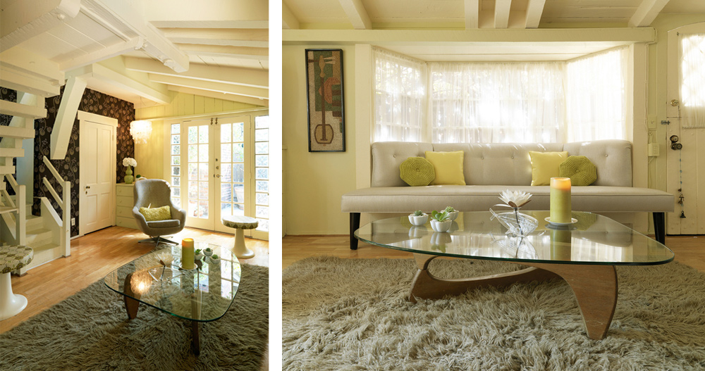
This small modern house design had two challenges; the first to open up the space and make it visually appear (and feel!) more expansive and the second to resolve the visual clutter. Small places can either feel cozy and intimate or have the opposite effect when they aren’t organized well so that everything has a place to live or have too much going on. When I began this project there was a way too large sectional sitting in front of the window nook which was filled with plants. It was too much furniture for the small room. The design concept had to make the space appear more expansive, bring out the charming architectural details and cure the feng shui issues (such as the beams) while never loosing her wonderful artistic personality.
Visual clutter was also a big issue. It is seen in a space where there are not necessarily too many items, but it still looks and feels chaotic because of the way the things are placed. When visual clutter is present it can be a constant sensory overload which can drain you mentally. My goal was to shift the floor plan to feel more inviting, balanced and grounded. By doing that, the space would open up to seem larger and more dynamic.
My client’s desire was to continue to live in her home, but bring her clients into the space for private consultations. This meant that my design concept needed to be set up in a way that was stylish and polished without loosing her edge and artistic personality. One thing that I was cognizant of was to never allow the space to remind her of her work. It is important to use your home as a refuge to settle the brain and shed the stresses that come from being a small business owner.
Another initial observation was that walking into the TV was neither a good metaphor for her work ethic or the relationship she wanted to manifest as it represents the opposite of good branding for her business and as an introspective activity, it was not conducive to her relationship goals.
Solution
To make this small modern house feel more expansive and stylish I built the main seating directly into the window nook and used the glass mid century Noguchi coffee table to keep the space feeling light and open. The wallpaper added dimension while grounding the room and giving a contemporary anchor to the hip retro-modern style.
I began by exploring her personal goals, life patterns, and visceral responses to color, textures, and decor styles. I needed to know the goals of her business and key notes to her brand, as well as the subtle nuances to her sensibility so that I could create a decor style for her bungalow that would do everything she needed it to do.
The chair, pendant light and flowers (better metaphors for her relationship and branding goals) gave the eye a beautiful place to land as they draw you into the space and provoke a feeling of invitation. The overhead lighting was concealed and strategically directed to cure the beams in terms of Feng shui – beams can bring an oppressive energy. The end result is a harmonious, creative and stylishly modern bungalow interior design style that was customized just for her. On a side note, she has been in a wonderful relationship ever since.
Join our creative community to get updates on new case studies, tips, inspiration & resources.

