Challenge
If you read our previous case study for a condo transformation called feng shui house, this project is the same client after she got married and moved into their first home together in Beachwood Canyon, Los Angeles. I was thrilled when they was asked to design their first home together and up to the challenge of finding creative ways to design on a dime.
They, like my earlier project called design for couples, they too were very different in their sensibilities. Both film producers, young, smart and ambitious, as opposites attract, she was very feminine with a strong playful side and a love of bold color. He had a more muted palette, leaning slightly towards the prohibition style and wanted a place for some of his favorite things such as his antique camera collection.
Just married, my intention was to empower them as a couple and inspire them to feel creative. We began with the awareness that he didn’t resonate with the previous design I had done for her condo which luckily sold in one day and and they negotiated many of the main pieces we did for her such as their sofa, cushions, curtains, art, and the entire patio. I mapped out a few options for signature looks that would capture both their sensibilities together in one cohesive home style.
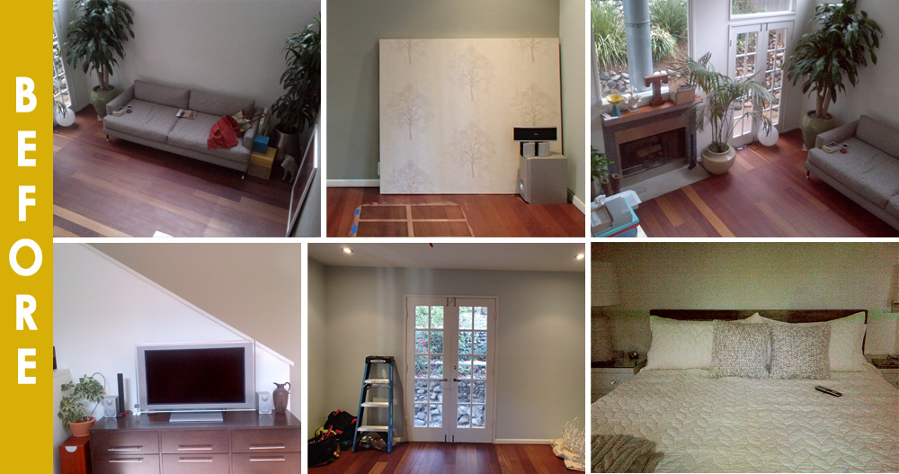
Another challenge was to update the home which previously had a patchy red floor running throughout, walls that were consistently beyond despair, areas which needed a new approach to the reflected ceiling plan, and architectural details such as the cap on the stair that needed to be modernized. Visually, there was an under-utilized 17′ ft high ceiling in the living room which caused a lack of dimension and dynamics. The other main rooms were very small, so finding ways to open them up and give them a better flow was a primary focus.
Solution
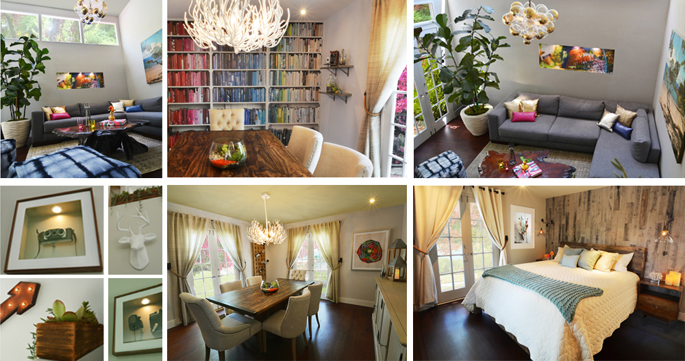
A budgetary design begins with a good, inviting floorpan, sound basics (many of these are from local second hand shops) and creative ways to showcase the walls that will all stay within our visual concept that will showcase both of their personalities. The end result was a home that is distinctly “them” as I found the bridge between their styles that would get them each to respond as individuals.
Finding fun ways to have art without breaking the bank, I had a fun time showcasing his vintage camera collection. They were a little weary at the idea at first, but once they got on board it ended up being one of their favorite nuances. I created off set colored niches with walnut frames to line the stair well like an art gallery which displayed his three favorite cameras. I wanted to have a strong voice for each of them so neither of them felt over shadowed by the others design sensibility that they didn’t resonate with.
To give them a beautiful symbol of their recent nuptials, I took a snapshot from their honeymoon and printed it on wood to allow the wood grain to come through the photo to give it a vintage feel. This was a metaphor for their love, as well as triggering wonderful memories on a daily basis.
Another way to bring in special art was to turn a friend’s photo into a lit niche (over the sofa). This had the added benefit of creating more depth in the room and helped to carve into the composition. The same type of thinking was true by adding the whimsy of a colorful bookshelf wallpaper in the dining room, as an unexpected twist to the eclectic industrial and farm house furniture with the stark modern Moth design chandelier. It also made the room seem more interesting and appear more expansive.
In the end, this bohemian modern home stayed on budget and became the perfect dwelling for this young entertainment power dual to rejuvenate, create, and entertain.
Join our creative community to get tips, inspiration, resources and invites to private events. If you would like a budgetary design consultation or have a small project, our interior stylist service may be perfect for you.


