Challenge
The challenge for all our commercial boutique interior design projects is to find ways to articulate the heart of the brand within the design concept for the company. Each time someone comes through your doors, whether it be a store, office, hotel, or restaurant, you are selling to the client. The physical design of your space becomes an opportunity to convey your story, values, underlying message, and how you are set apart within your industry. Our philosophy is to let the stylized space give an impression of what is compelling about your work, while creating a magical ambiance or inviting environment in which people want to return again and again.
Using our specialized techniques we set up the space for your specific needs and desires. You may want your staff to be motivated for better productivity, your clients to feel soothed and calmed as they walk into your spa, or have your team feel creatively charged in an industry that is built around ideas. We know how to use the space make your work become more inspired.
Our boutique interior design projects always implement ways to navigate your customers into merchandised areas that were once “dead zones” where people missed precious items. From the initial set up, each area in a boutique needs to feel active so that customers don’t miss any opportunity to see and purchase your product.
Solution
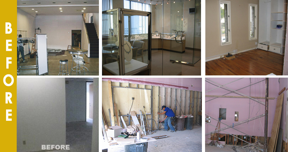
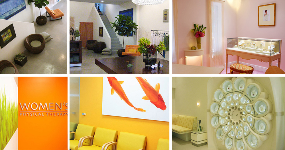
Of the three jewelry stores we designed, our approach was very different for each one, creating an ethereal old Hollywood atmosphere for for Erica Courtney and a high-concept design Alan and Layna Friedman. Both Beverly Hills jewelry stores enhanced their brands by giving them an environment that set each of them apart within their industry. Though they were already well known as designers, each of them had previously had stores that didn’t convey anything compelling about their brand. There was no heart, personality, or message coming through. We designed their spaces to be as impactful as their jewelry, but also showcased a bit of their personality as it became part of the process of branding their spaces and showing their customers what makes them unique and special compared to others in their field.
The elegant store we created for Erica Courtney used her favorite color pink as the star. Juxtaposing our hint of Louis XIV jewelry stand display with our modern wall treatment – a unique ombre wall paint style that started with coral on the bottom, getting lighter and lighter as it went up until it met the line of the jewelry case – when it shifted into a pale ballet pink to the ceiling. This created a dreamy, gorgeous, and glamorous effect. The feel of the store was ethereal mixed with opulent touches and warm glows. Bringing out a warm feeling in this way allowed her clients to associate how they felt in the space with the experience of buying her jewelry.
Alan and Layna Friedman had been known for their colored diamonds. We wanted to do something that no one had seen before for their store. It was a rare opportunity to design a unique interior design concept that was as original and detailed as the jewelry he designed. We chose white displays in a medley of materials to allow his colorful diamonds to be framed like works of art. His original space (see above) was in a high rise office building in Beverly Hills. In designing the main circular display I ended up in an unexpected collaboration with James Peterson who hand sculpted the case from our pourable stone selection. Our initial design was the same as seen above, but with a different configuration for the glass displays. James brought in an illustration of multiple circles in the shape of a mandala that worked perfectly with our design concept. It ended up being remarkable project.
The sustainable boutique used mostly eco-friendly materials, while showcasing the five natural elements in a balanced way to exude an earthy, natural, yet urban vibe. The materials ranged from bamboo, an innovative sustainable concrete like floor, plyboo – wood pulp from an abundant tree found in the Amazon, as well as recycled acrylics and textiles. The space had an indoor outdoor feel to the design. When entering you were greeted with a beautiful wall-mounted buddha fountain (not shown) and lush greenery throughout with subtle pops of color to give it a stylish look.
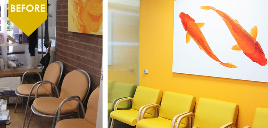
We designed both the Beverly Hills and Santa Monica offices for Women’s Physical Therapy Rehabilitation offices which also do yoga and pilates. We set up the space to make clients feel welcome, lift their spirits, and give them confidence in the process of transforming their health. We showcased our client’s fun, playful personality with the creative colors of orange and yellow to bring out the heart in the space. Using natural materials such as bamboo flooring, lots of healthy plants, strategic selections of art, and an inviting floor plan, the space encourages people to feel like they have come to a spot where they will be healed. The end result were several commercial interior design projects that are a fresh, feel good environments.
Join our creative community to get updates on new case studies, tips, inspiration & resources.


